Scaling Facebook Ads For Ecommerce [Ultimate Guide]
Download Now.
Sadly, most people pay little attention to their about me page, and it costs them sales and subscribers.
Your about me page is an underrated and often overlooked page but it shouldn’t be.
Did you know that your about page is often the 2nd most visited page behind your homepage?
Take a look for yourself at its performance in Google Analytics.
Chances are it’s in your top 3 most visited pages…and most bloggers don’t use this to their advantage.
Think about it…
People who visit your about me page are genuinely interested in you, and are A LOT more likely to subscribe to your email list.
Here are 15 actionable tips for writing an amazing about me page.
And even better…
Most of these tips take 5 minutes or less.
Keep Reading.
task completion time: 5 minutes
Having at least one call to action (CTA) on your about me page is a no-brainer right? But have you considered adding a secondary call to action?
Here’s why:
A secondary opt-in not only doubles your chance of getting more subscribers, but it also helps prevent lost conversions.
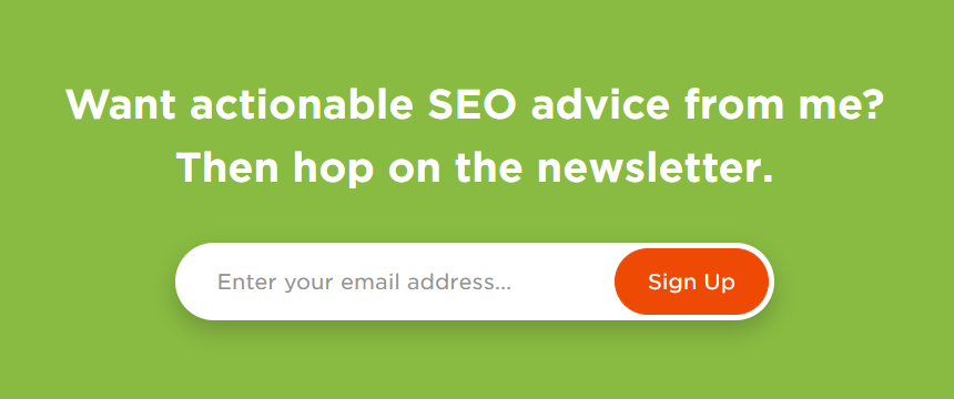
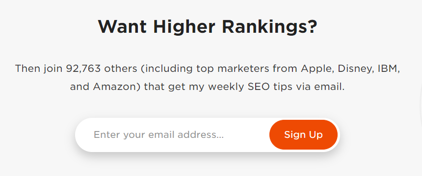
A great example of this is on Brian Dean’s about me page. He clearly understands the power of 2 sign-ups and uses them accordingly:
Remember:
1. Don’t make both calls to actions exactly the same.
For example:
Your primary CTA could highlight one benefit and invite them to sign-up to your newsletter, and your secondary CTA could offer an even more compelling reason: ‘Get my free cheat-sheet on [insert topic] when you sign up”.
The point is this…
Show your readers lots of value by emphasising the benefits they get when subscribing. And using 2 CTA’s is an easy and effective method of achieving this.
2. Positioning is important.
Place your primary CTA just below the fold, next to some social proof and the secondary CTA towards the middle-bottom near some success indicators (check the about me template in the next step for more details on this).
Why?
Nobody likes being hit with a ‘SIGN UP NOW’ the very second they land on your page, and most likely your readers will scroll down the page anyway.
task completion time: 1-20 minutes depending on task.
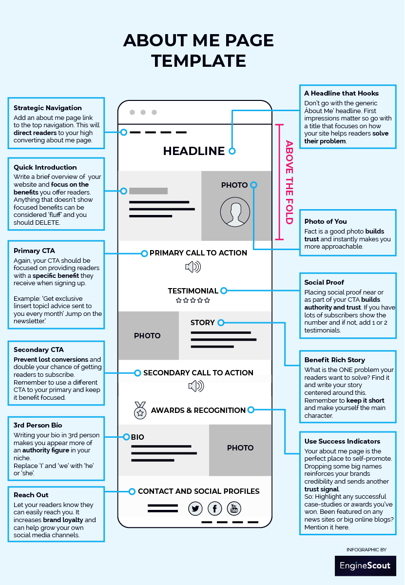
Having a clear, well-laid-out about page can make a BIG difference to your visitors’ experience, and if done correctly, it’ll generate more email sign-ups for you.
So, I’ve put together this simple and easy-to-use template for writing and designing your about me page.
It’s designed to raise the bar regarding how readers perceive you professionally and give them every reason to subscribe to your email list.
task completion time: 2 minutes
Titles matter and to be honest, 99% of sites go with the generic ‘About Me’ headline, and it offers zero benefits to your readers.
Look at it this way…
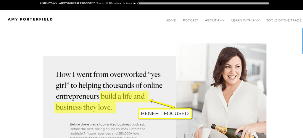
They’ve already clicked on your ‘about me’ link so why do you need to remind them again? Instead, use this as an opportunity to hook them right away with a benefit focused title.
Here’s a couple of great examples from Amy Porterfield and Chris Ducker that illustrate what I’m saying.
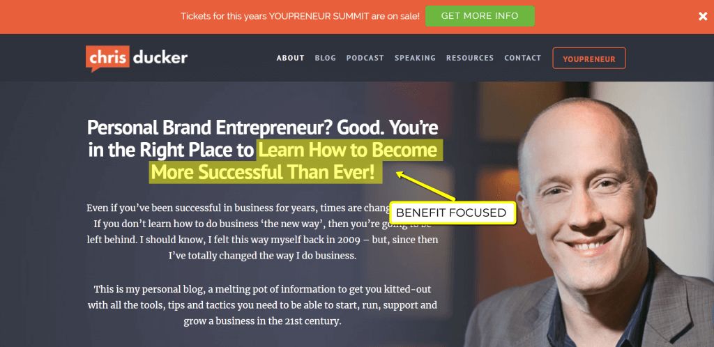
This technique can be used for any blog or website for that matter too.
For example:
Let’s say you run a photography blog; you could go with something like:
‘Practical photography advice no matter the shot.’
Or…maybe you have a travel blog about South America:
‘Looking for in-depth South American travel guides? I’m glad you’re here.’
My point is this…
First impressions matter so take a few moments to write a benefit focused title that solves their problem. Doing this shows immediate value and will go a LONG way with getting them to hit the subscribe button.
If you’re struggling for ideas then start with this simple improvement: “About [insert brand name here]” for now.
Even better…
“[Brand Name] is all about showing [solution to their problem]”
“Become a better [hobby], ready?
Bottom line:
Make your title benefit rich and centered around your readers biggest problem. That way you’re already making them feel more connected and wanting to subscribe.
task completion time: 5 minutes
If there’s ever a time to shamelessly self-promote, your about me page is the place to do it.
And here’s the reason why…
It shows credibility and positions you as an expert in your niche so make sure you include at least one of these success factors.
Successful Case-Studies
Do you have any past success stories you can share with your readers? Perhaps link out to a case study about one of them or even yourself. And don’t worry, the case study doesn’t have to set the world on fire. It’s also ok if your case study showcases a small win, that’s enough to prove yourself.
Bottom line?
What matters is that your case study is genuine and transparent so no need to go overboard on this.
Awards & Recognition
Have you worked with anyone big in your industry or any well-known companies on your email list? If you do, mention it.
Here’s a great example from Nick La’s about me page:
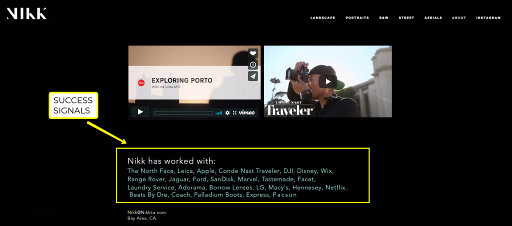
You don’t have to explain any of the details, say you’ve worked together and drop their name.
It’s that simple.
For example: Let’s say you run a graphic design blog and you notice a couple of emails on your list from a large, reputable construction company. You could say something like: “That’s why companies like [company names] subscribe to my newsletter.”
Maybe you were featured in a local or national news article or a big online blog? Well, this is a great time to tell your readers, and it’s precisely what my ecommerce agency does too.
My point is this…
Dropping some names reinforces your brand’s credibility and provides more evidence for turning readers into subscribers.
task completion time: 8 minutes
And not just any photo…
Truth is a great photo makes you instantly more approachable and sends a strong trust signal to your audience right away.
Your blog isn’t some faceless brand run by a machine, it’s you, a real person, so make sure the photo is of you.
Here’s a great example from Sharon’s about me page on her Digital Nomad Wannabe blog.
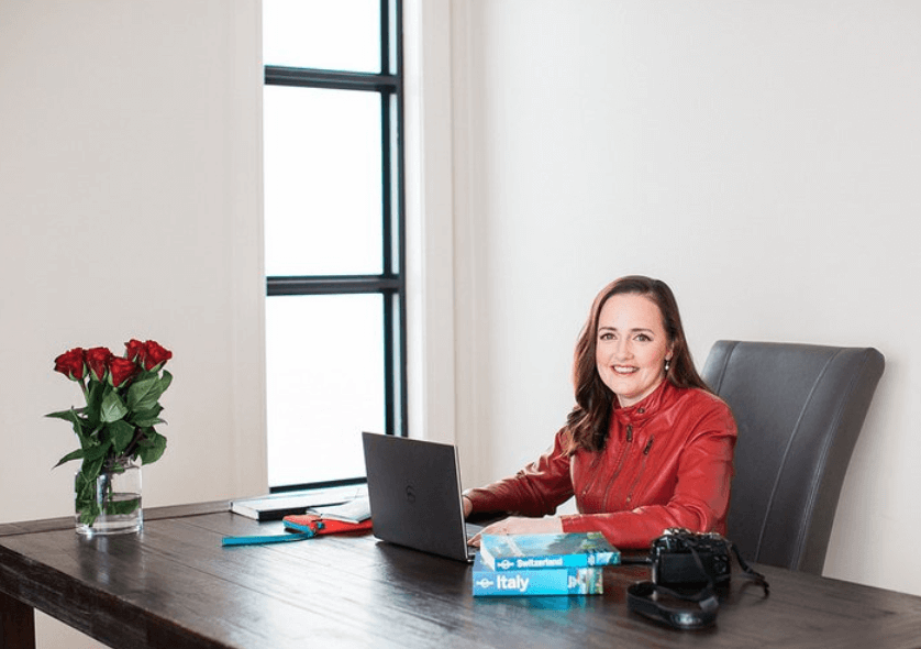
Important things to remember:
1. Smile
2. Place your photo above the fold, so it’s one of the first things visitors see when landing on your about me page. It helps keep them on your page for longer.
3. And don’t be afraid to include multiple photos as readers scroll down your page.
Pro tip: Action shots of you working on your craft work great. Not only will the extra photos keep your readers engaged longer, but they’ll also feel more connected with you.
task completion time: 10 minutes
Social proof is a FAST way to build trust and authority with your visitors, and there are two strategies I like to use depending on how big your site is.
Strategy 1 – If you already have a big following then this works great.
If you already have a large following and I’m talking +4000 email subscribers or +5000 social media followers then go right ahead and showcase that fact.
A great place to add it would be next to your primary call to action (refer to the about me page template I talked about in tip #2).
And you could say something along the lines of: “Join the 8,657 members who get my weekly [your topic] tips’. You get the point…
Strategy 2 – When you don’t have a big following yet.
The answer is simple:
Add 1-2 testimonials to your about me page that show the benefits of subscribing.
Here’s a great example from Bernadette Jiwa’s about me page.
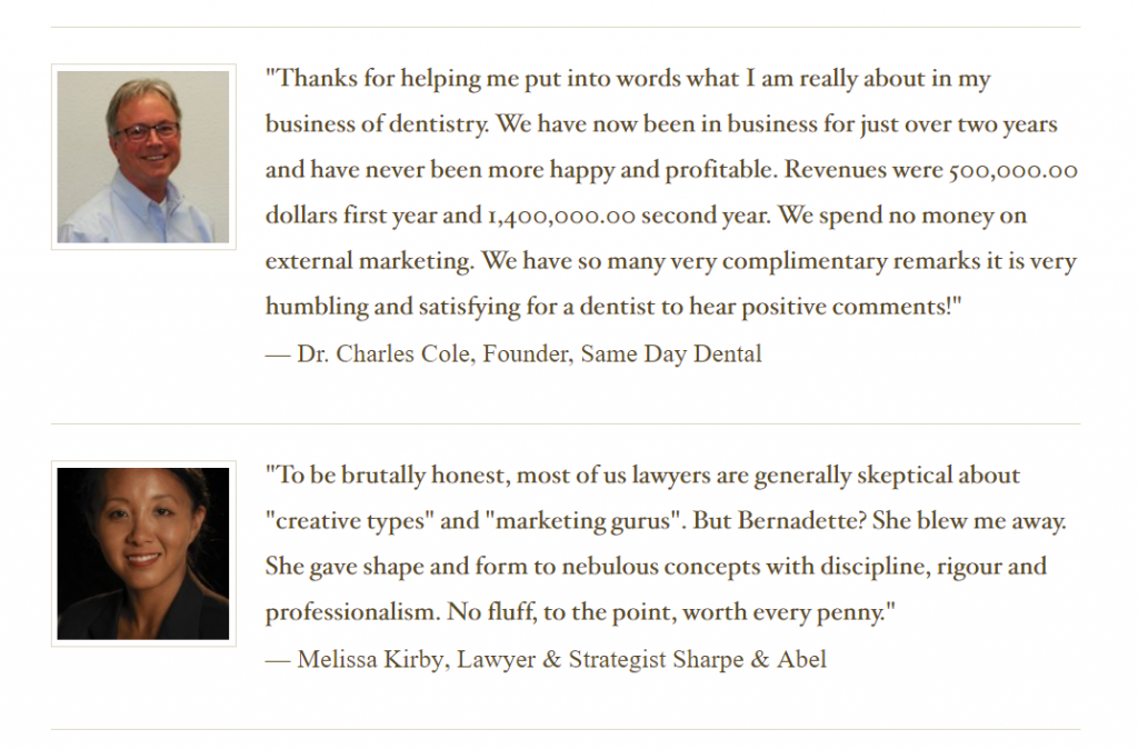
If you’ve already managed to sign-up, a few readers email them and ask them if they’d mind giving you a testimonial about your blog.
Here’s an email script you can use:
Subject: I would like to feature you on my site
Hey [Their name]
I want to let you know you’re one of the first email subscribers to [blog/brand name] and can I say a BIG WARM thank you.
I hope you’ve found all the information valuable? I have a tonne of great [topic] tips I’ll be sharing with you soon.
Seeing your one of my first subscribers, would it be too much trouble if I asked you to be one of my first testimonials also?
That would mean you’d have to write 1-2 sentences about how my blog has helped you and I’d share it on my website.
If that’s OK, please kindly let me know. Otherwise, thanks again for subscribing.
Have a great day!
[Your name]
Pro-tip: When it comes to testimonials, getting the persons actual photo along with their written words can go a long way in showing your readers some serious social proof. So after they’ve already agreed, kindly ask them if they wouldn’t mind sending a picture of themselves too.
And one final thought…
As your brand grows, I’d recommend sharing both testimonials and success stories across all your pages, not just your about me page. For example: I share both client testimonials and success stories for my eCommerce clients on my eCommerce SEO agency page. That way you’ll convince even more readers you know what you’re talking about.
task completion time: 5 minutes
Have you ever read a great article and suddenly been stopped right in your tracks by a glaring spelling mistake?
Here’s the problem…
Spelling and grammatical errors stick in your readers mind like glue.
Even the most straightforward error can instantly devalue your work and have a significant impact on whether readers become loyal fans or leave your site.
So, take two mins and run your text through at least two spell checkers like Grammarly and Microsoft Word to prevent this from happening.
Pro tip: Ask a couple of friends to have a read through it too. Sometimes a fresh pair of eyes can do wonders helping you see things missed by your own.
task completion time: 15 minutes
If you want readers to stay with you and maintain more persuasive power, then your about me page should be as short as possible.
And keep it focused on exactly how your brand benefits them. Anything else should be considered ‘fluff’ and removed.
The bottom line?
When writing your about me page always remind yourself…
“If it doesn’t matter to my reader, it doesn’t belong on my about me page.”
Finally:
1. Read through each paragraph and ask yourself “how does this benefit my readers?” If you can’t think of a legitimate answer: DELETE
2. Ask yourself:
Is there anything missing from my about page that should be there? Specifically, have you clearly shown your reader exactly how you can benefit them?
task completion time: 5 minutes
You’ll want to write the majority of your about me page in 1st person, but when it comes to writing your bio, it can be beneficial to use a 3rd person perspective.
Why?
You will appear as more of an authority in your niche which adds more credibility to your brand.
Example:
Before
“I’m a graphic designer at heart with a passion for sharing my knowledge collected from ten years of experience working for one of the world’s largest graphic design firms. My works have been recognized with several industry awards and published in several magazines. I live in Melbourne, Australia with my husband Brad and pet dog Mikey.”
Changing it to 3rd person
“Susan is a graphic designer at heart, and she has a passion for sharing her knowledge with other designers around the world. With over ten years of experience in the graphic design industry, Susan’s work has won several industry awards and published across several industry-leading magazines and news publications. Susan lives in Melbourne, Australia with her husband Brad and their three yr old Labrador.”
You see what I mean here.
Replace the ‘I’ with ‘she’ or ‘he’ and your bio will appear instantly more authoritative.
task completion time: 5 minutes
This step follows in nicely from the previous step about writing your bio.
Sprinkling in a couple of fun facts about yourself not only makes your blog more memorable, but it also increases reader engagement and puts them at ease with you.
Here’s a great example on Ishita Gupta’s about me page where she uses fun facts to put her readers at ease, and it instantly makes her more likable.
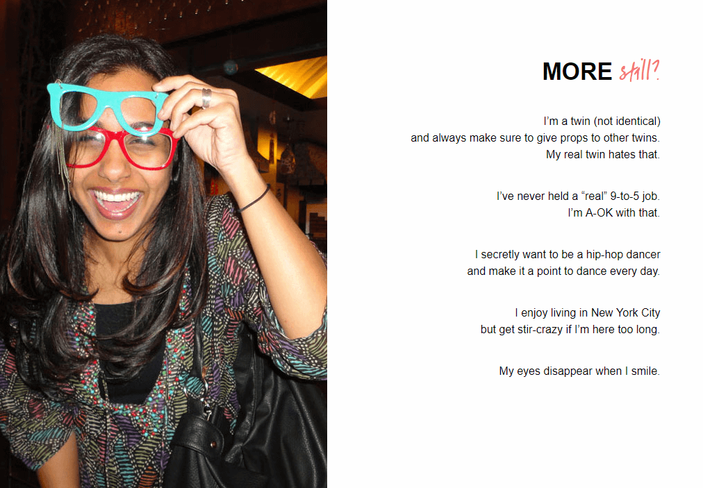
And here’s why it’s valuable:
You’re going to have a hard time convincing anyone to sign-up if they’re uptight or overwhelmed so remember: Relaxed readers are subscribing readers and a couple of fun facts can make a big difference…
Here’s a couple of ideas to get you started:
What was your first car and what did you love/hate about it?
Something on your bucket list you can share?
Favourite sports team?
A celebrity look-a-like?
It can be anything really, keep it light and don’t take yourself too seriously.
task completion time: 5 minutes
This step should be implemented across your entire site, having an easy-to-read font that’s a decent size will improve your readers’ experience, not to mention it’ll keep them on your page longer.
Make the font easy to read, 15-18px works well. Personally, my site uses 18px text size because I don’t want my readers having to press their face against a screen.
Also pay attention to your about me page’s overall layout and design. Professional Web design is an often overlooked by a lot of people and it’s an instant turn-off if your website doesn’t look nice.
task completion time: 10 minutes
This step is often missed by bloggers and can make readers see you as unapproachable resulting in less engagement and less brand loyalty.
Loyal readers are more likely to talk about you with others and share your content.
So make sure you openly display your contact details like your email, social channels and invite readers to get in contact. You never know who might reach out one day.
Actions:
1. Go ahead and add your contact details and make sure they’re visible.
2. I prefer to add contact details towards the bottom, and you can refer to the template I shared earlier in this post to help guide you.
task completion time: 1 minutes
This tip couldn’t be any easier.
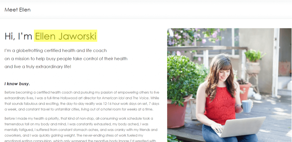
Adding YOUR NAME creates a deeper connection with your audience. No longer a faceless brand, your readers will feel more connected with you.
Just make sure you add it above the fold, so your readers don’t miss it.
Here’s a great example from Ellen’s about me page.
task completion time: 25 minutes
Here’s the thing:
Most people start with the ‘story part’ and then try to connect it back somehow to their readers. And it often leads to a pretty flat piece of content.
Try this method instead:
PART 1: Start with the problem first.
1. Ask yourself, what’s the ONE (most important) thing you help readers solve?
2. Think about it for a moment and write it down. It shouldn’t be any longer than two sentences, preferably 1.
3. Now it’s time to find a personal story that fits the ONE problem.
For example:
Let’s say you run a blog about all things related to eBay. The ONE problem you help readers solve might be: ‘How to successfully sell products on eBay.’
Now it’s just a matter of writing a personal story that fits the problem you’ve identified.
PART 2: Writing your personal story.
1. Keep it short, no more than 8-10 sentences (less is best).
2. Remember: YOU are the main character in the story.
3. Create a big gap between the start and end of your story to maximize impact.
What do I mean by this?
Well, start with your lowest point first.
Example: Tell your readers about ‘the time you were flat broke’ or ‘how you were fired from your job,’ you want it to be a ‘rock bottom’ moment you experienced.
And end the story at your highest point: That light bulb ‘a-ha’ moment where everything just clicked for you.
4. Make your story as personal as possible and be transparent. This can put you out of your comfort zone, but it makes a HUGE difference when wanting to build strong connections with your readers.
task completion time: 2 minutes
Like I mentioned at the start of this post:
Your About me page is one of the most visited places on your site.
And most importantly:
These readers are on your about page for a REASON.
They’re starting to take your brand more seriously which makes them even more likely to subscribe to your email list.
So pay attention to this step:
After implementing the tips in this post, your about me page will become a high converting page turning readers into subscribers. It’s now time to funnel as much traffic there as possible strategically.
And here’s a simple way to do it:
1. Add a link to your about me page from the top navigation of your site and for even better results, put it in the 1st or 2nd position like this…

2. You can also place a link in your footer menu or sidebar navigation too.
This small change will instantly funnel more traffic to your about me page making it ready to capture more email subscribers.
There’s no doubt the above steps are easy to implement, fast and will transform your about me page into a subscriber generating machine.
But here’s the real challenge:
Which of the 15 actionable steps from this post will you use for writing or upgrading your about page?
Will you add the secondary call to action?
Leave a comment below right now and let me know.
Download Now.
26 Responses
Amazing article Jonathon! Great summary of information and many items that I will be able to include on my own website, thank you!
No worries Jeremy, glad it helped.
Super helpful! Love how you included the time needed to action these, will make planning the overhaul of my About Me page a lot easier!
Looking forward to the next post, thanks!
You’re welcome Cheyenne.
Great resource! Will use this to makeover my own ‘About’ page.
Keep up the good work!
Let me know how it goes Bill.
Great tips and content! Not enough people realize how important the About Me page of their site truly is. It’s really surprising how often they are visited in comparison to other pages on a site.
I couldn’t agree more with you Zac. Thanks for your insight.
I saw your post on Reddit and as a new blogger myself, found it very helpful. I’ve bookmarked it so that I can refer back to it to work on the things you’ve talked about here. Thanks for the insight!
Glad to hear you’ve found this helpful Amanda, you’re welcome.
A great start! Congratulations, Jonathan! Your article is very professionally written and contains handy tips.
Thanks Michael!
Awesome!!
Thanks Kai!
Hi,
Very Good Article. I really appreciate this information for my blogs about me page.
Thanks For Sharing. Keep up the Good Work.I want you to know; You’re the best thing that happened to my blogging career thus far. Thanks for always sharing.
Nicole Graham
Thanks Nicole, glad to hear you found these about me page tips useful!
Just wanted to convey my regards. This was really a valuable post, especially the free template. I will ensure that my friends also read this as soon as possible. I cannot wait to share this. Thanks!
Thanks Steve!
Great tips and content! Not enough people realize how important the About Me page of their site truly is. It’s really surprising how often they are visited in comparison to other pages on a site.
Agreed! Glad to hear you found it helpful.
Hi, really good article and appreciating work. Thanks For Sharing. Keep up the Good Work and keep writing the wonderful article like this.
Thanks Antonette, happy to hear you found it useful.
I’m in the process of writing mine. Now I have an idea of what I’m going to put on it. Thanks!
Wow, such an informative article. Looking forward to trying them out.
Thanks Yasin!
Great article, really helpful